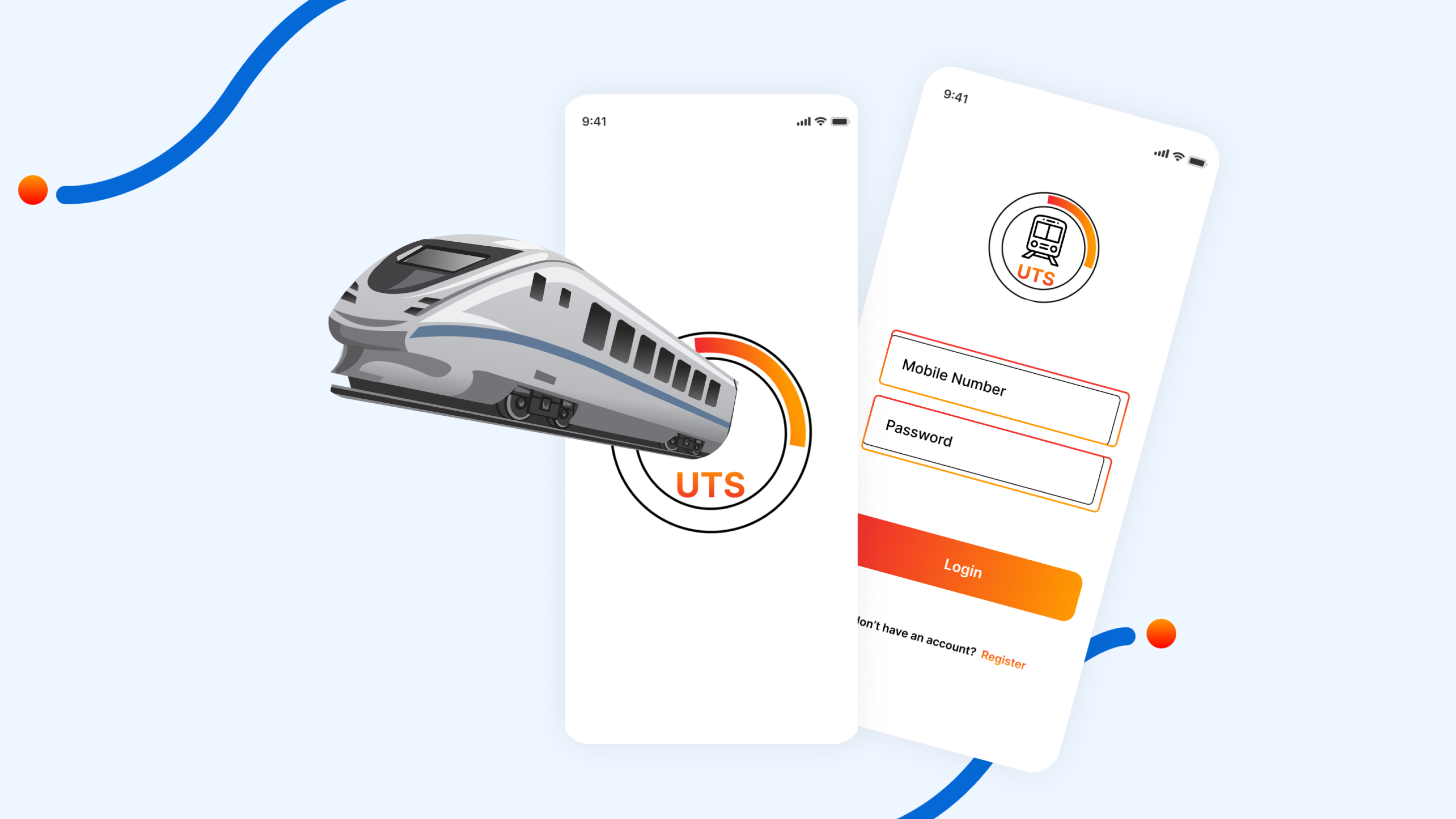
Railway Ticket Booking App UI Figma free templet
₹999.00 Original price was: ₹999.00.₹0.00Current price is: ₹0.00.
Made on figma
More From This Creator
In the realm of travel convenience, railway ticket booking apps like UTS have become indispensable tools for commuters. However, recognizing the need for continuous improvement and evolution, I embarked on a mission to revolutionize the UTS app’s user interface using Figma.
Delving into the existing UI’s intricacies, I identified critical pain points through exhaustive research and user feedback analysis. These included issues with navigation, lack of intuitive design elements, and visual inconsistencies. Armed with these insights, I set out to reimagine the UI with the aim of enhancing user experience and simplifying ticket booking processes.
The redesign process commenced with ideation and wireframing, where collaborative efforts and user insights laid the groundwork for the revamped interface’s structure. Prioritizing user needs, I conceptualized intuitive navigation flows and streamlined user journeys to ensure a seamless booking experience.
Utilizing Figma’s robust design capabilities, I crafted high-fidelity mockups that breathed new life into the UTS app’s interface. Paying meticulous attention to usability and aesthetics, I curated color palettes, typography, and visual elements to create a cohesive and visually appealing experience.
Prototyping and testing were integral phases, allowing for validation of the redesigned UI’s effectiveness and identification of areas for improvement. Through iterative refinements based on user feedback, the final product emerged—boasting streamlined booking processes, enhanced search functionality, and personalized user profiles.
In conclusion, the redesigned UTS app UI sets a new standard for railway ticket booking apps, offering commuters a seamless and delightful experience. As we continue to iterate and refine, the future holds boundless possibilities for further enhancing the app’s user experience, ultimately transforming the way we travel in the digital age.
General Inquiries
There are no inquiries yet.


Reviews
There are no reviews yet.